Final Lookbook
- mwashbrook1
- May 5, 2021
- 2 min read
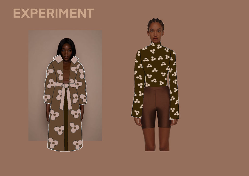
For this look book i wanted to create something that was hyper feminine to tie in with the collection and i was also really inspired by the floral aspect to the collection and so this look book draws from that. I was mainly inspired by JW Andersons show in a box collection with the way he uses a cut out model in the garments and collages the three elements together, the background, the model and the garments. This was how in the end we overcome the problem and decided to use this style which Farah then digitally edited the line up onto a model who I had previously photographed in the studio. I then edited these final looks on top of floral backgrounds I had collaged using different flowers that i took from vintage flower books and collaged them so they was blooming out from behind the model, in the style of artist Diana Moss. One of the feedbacks i had previously gotten from my tutor Steph was to experiment with adding in different mountain landscapes in order to reflect the ski-wear aspect to this collection so i experimented with adding these visuals into some of these images as well as the flowers in order for it all to tie together. During the making of the look book I wanted to keep the vintage aspect of the ski-wear collection, paying homage to the inspiration, so I used designs such as vintage postcard stamps and passport stamps to also convey the idea of adventure, as well as using the vintage flowers to collage the backgrounds. I still wanted to make the look book look sophisticated and modern so I used the liquify tool to distort floral backgrounds on some of the images in order to create these bright and full of colour images to go behind some of the images.
Front cover

First double page spread, with collection description to introduce the collection

Pink double page spread

Purple double page spread

Red double page spread

Yellow double page spread

Back Cover

These are the front and back cover i made for the lookbook. To make these i used the pink floral pattern that i had previously distorted by experimenting with the liquify tool on pro-create. Below is the first double page spread i made where i placed the brand/collection manifesto. For both of these i was inspired by the idea of skiwear and adventure and travelling so i used a vintage stamp template as i was inspired by postcards. This is where i have placed the visuals for the front cover and also where i will place the manifesto. I also used vintage travel stamps to convey the idea of exploration and adventure. For the front cover i collaged flowers around our brand logo which was created by Erin and for the contents page i collaged different snowy mountain landscapes with flowers as well as two of the looks from the collection.


Comments